Spawn cards
In review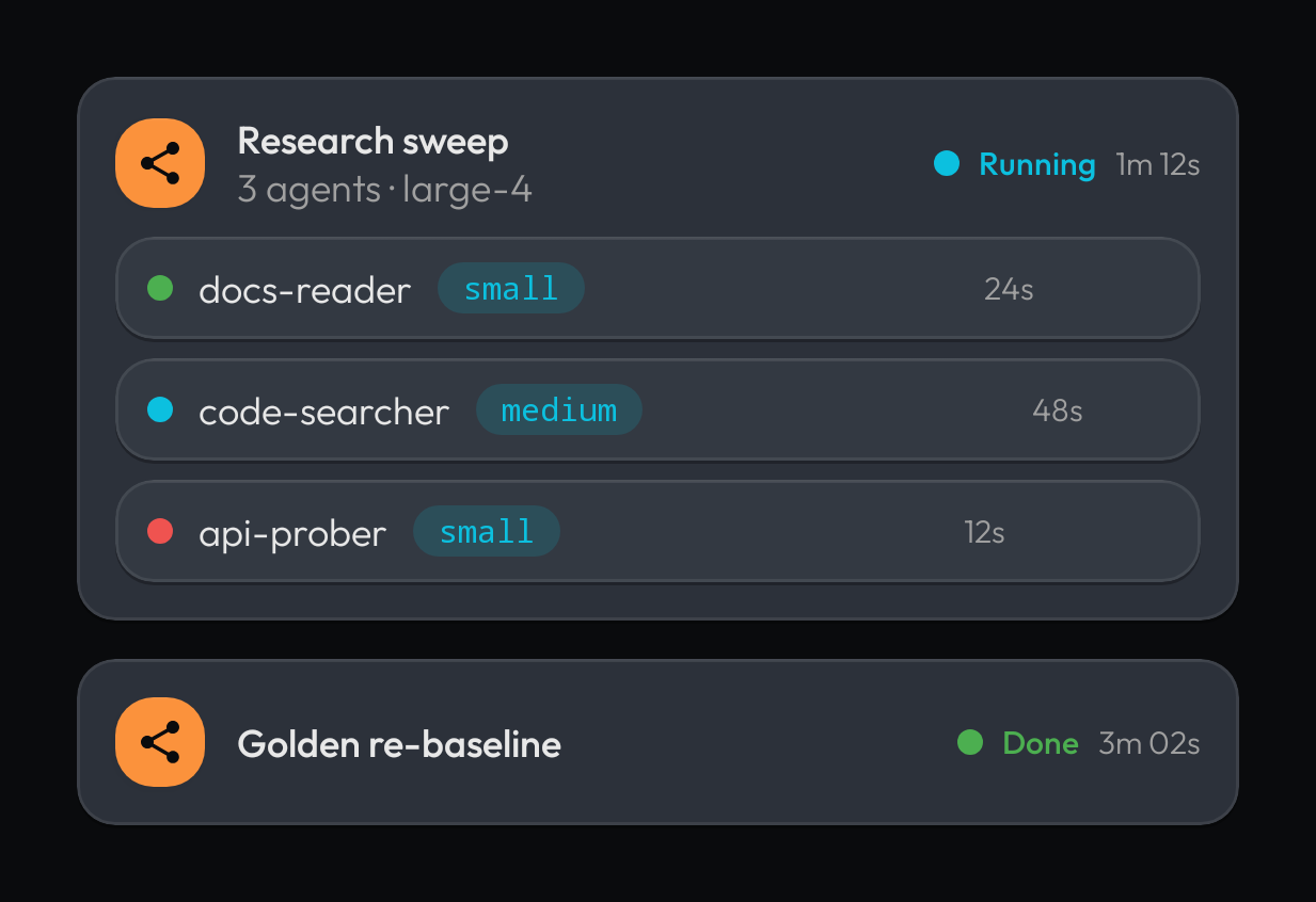
The spawn surfaces are tool-card-family siblings, and that classification is
settled: the agent-family tile leads (the spawn glyph knocked out of a filled
family.agent square; color rides a filled tile, never bare), the lifecycle chip
trails (dot + label + elapsed, so color never stands alone), and spawned children stack
inside at the card rhythm.
The lifecycle ladder is shared with the Agent widget:
RUNNING (info-cyan, pulsing dot), SUCCESS, ERROR. Pass animate = false to freeze
the pulse (reduced motion, deterministic snapshots).
NockerlSpawnBlockCard
Section titled “NockerlSpawnBlockCard”| Prop | Type | Default | Description |
|---|---|---|---|
title | String | The spawn block's name. | |
status | NockerlSpawnStatus | RUNNING / SUCCESS / ERROR, drives the chip. | |
subtitle | String? | null | Supporting line (model, task id). |
elapsed | String? | null | Elapsed label in the chip. |
animate | Boolean | true | false freezes the RUNNING pulse. |
children | slot | none | Spawned-children slot (stack child cards). |
NockerlSpawnChildCard
Section titled “NockerlSpawnChildCard”| Prop | Type | Default | Description |
|---|---|---|---|
name | String | The child agent's name. | |
status | NockerlSpawnStatus | The child's lifecycle state. | |
model | String? | null | Mono model badge text. |
elapsed | String? | null | Trailing muted elapsed label. |
animate | Boolean | true | false freezes the RUNNING pulse. |
Web
The react half rides the adoption lane: the dashboard’s spawn UI adopts these as the canon shape (dashboard implementation was research input only).